The challenge
Dark Harp had the lineups, the artwork and the energy — but, like most collectives, their whole online presence lived in a link-in-bio. That's fine for a personal page, but it does nothing to build anticipation or make buying a ticket feel effortless. They needed a real home: somewhere that captured the feeling of the night and pushed people straight to checkout.
The approach
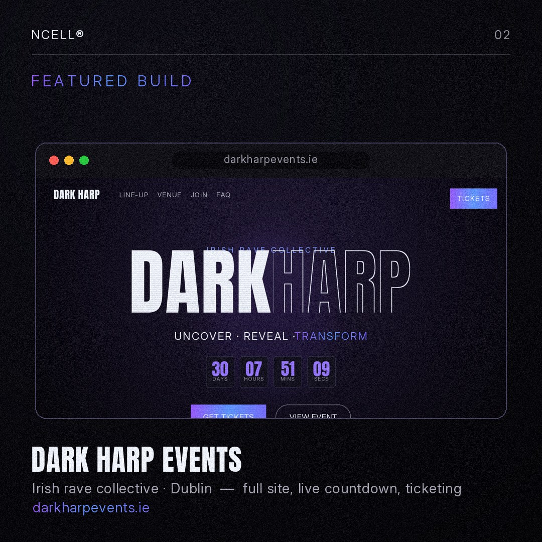
Everything started with the brief — their colours, their artwork, the mood they wanted people to feel. From there I designed a single, immersive landing experience built around one job: selling tickets. No clutter, no generic template, just the night, online.
What I built
- An immersive hero with the Dark Harp identity front and centre and a moody, club-ready aesthetic.
- A live countdown ticking down to doors — real-time urgency that nudges fence-sitters to commit.
- A full line-up reveal showcasing headliners, support and B2B sets.
- Venue & door info — address, age policy, set times — all in one tap.
- Direct ticket links straight to checkout, so there's no friction between hype and purchase.
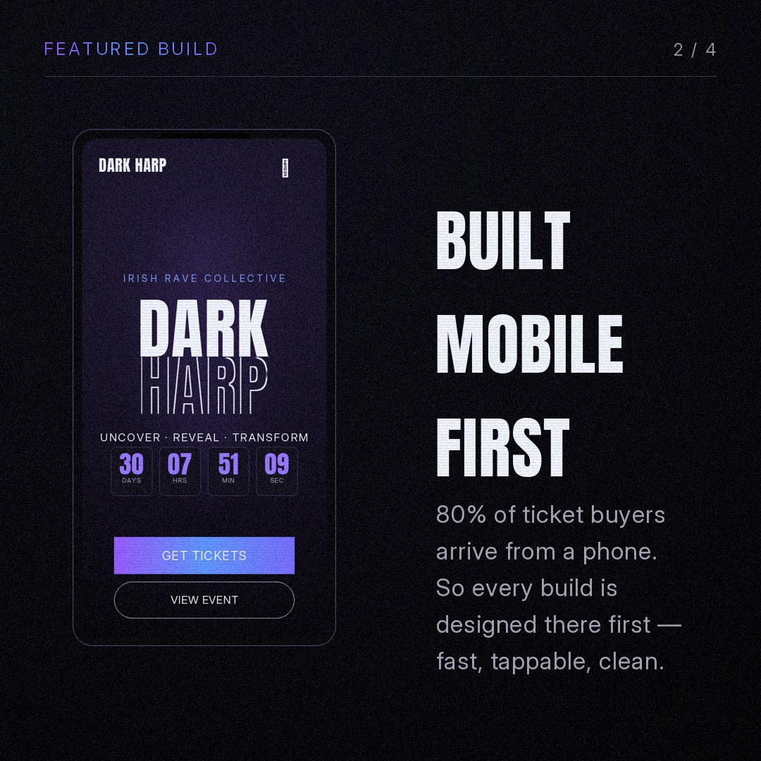
- Mobile-first everything — because that's where the audience actually is.
The result
Dark Harp went from a scattered link-in-bio to a polished, professional home that looks as good as the night feels — and makes buying a ticket a two-tap job. It's the kind of site that makes a collective look established and serious about its events.
This is exactly what I build for clubs, venues, festivals and collectives. And you'd see a free preview of yours before paying a cent.